
Monday, March 21, 2011
essay for project 3
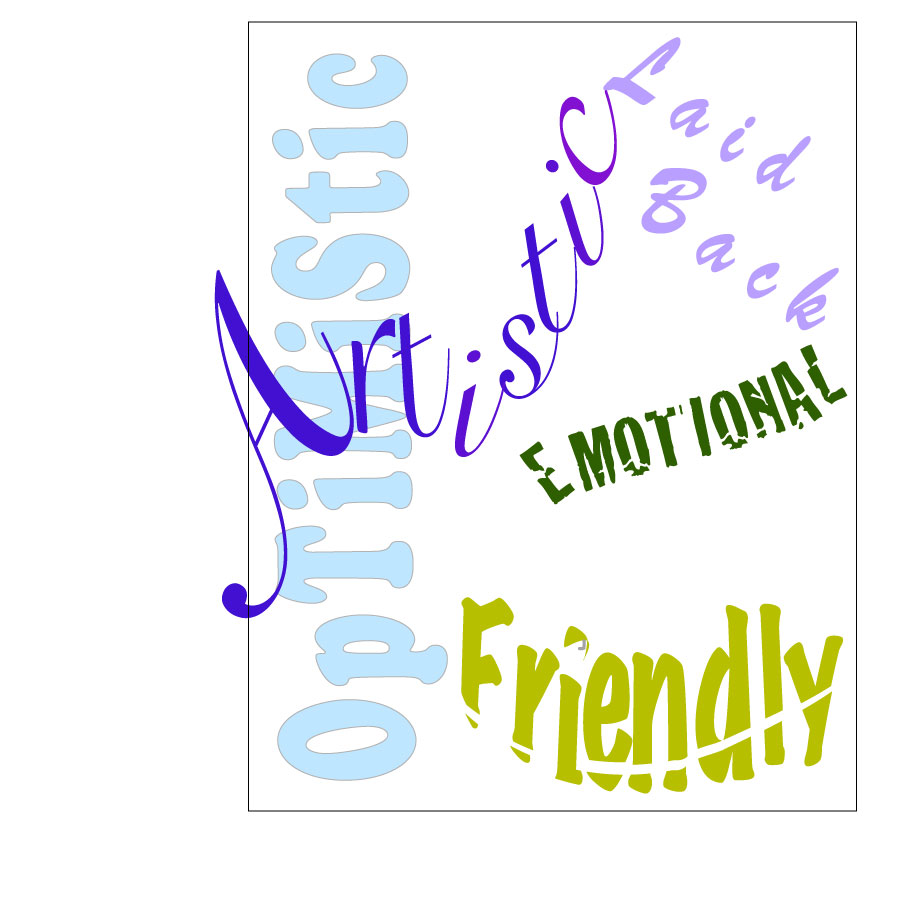
For the word artistic I chose a font that seemed free flowing and like a signature. I think choosing the font I did made the word look more artistic right from the start. After choosing the right font form I moved the individual letters of the words around and changed the shape of the word as a whole. This,again, emphasized the creativity needed to be artistic and how it is important to think outside the box.
In optimistic I chose a font that seemed friendly and positive. I also positioned the word vertically so the word was literally looking up like optimistic people do.
For laid back, I chose an easy going font that looked like a relaxed handwriting. I then chose a lighter value to emphasize the meaning of the words.
For the word emotional I chose a form or font that looked uneasy and sensitive. Also I positioned the letters in a way that looked like they are breaking off and all over the place just like emotions can be.
Lastly, the word friendly, was composed of a font that looked friendly in and of itself. Next I changed the shape the word which made it look like the smile part of a smiley face. Also, the shape of the cut out in the word resembles a smile as well.
I used the design principles on my piece as a whole to make the design pleasing to the eye while showing my personality. First off, I put emphasis on the word Artistic and made this my focal point. I did this by changing the scale of the word and also the value of it so it stood out more than the others. Emphasis then created hierarchy expressing what words most show who I am. Artistic is the most emphasized, then friendly, optimistic, emotional and lastly laid back.
My piece is balanced because of the varying angles of the words that compliment each other. Unity is created because of the proximity of the words to each other and the different focal points and how those focal points create movement through the design.
Repetition is shown because of similar values, shapes of words and negative space shapes expressed multiple times throughout the design. There also is a variation in values and scale.
Altogether, my design shows all the design principles and art elements in relation to each other while still expressing my personality as best I could.

Wednesday, March 16, 2011

Wednesday, March 9, 2011

Subscribe to:
Posts (Atom)